Comparison Page Playbook: Structure, Evidence, and Conversion Blocks
Visitors who search "Jasper vs Ryterr" or "tool X vs tool Y" are not browsing. They've already done a round of research. They have a shortlist. Now they're checking their work before spending money. That's a completely different reader than someone who found you through a how-to post, and your page has to treat them that way.
Most comparison pages don't. They read like product marketing with a competitor's name bolted on. The reader notices, loses trust, and bounces. The deal that was 80% done falls apart at the final yard.
This post breaks comparison pages into their actual components: the six blocks that make them work, the evidence types that hold up under scrutiny, the table design choices that read clearly on mobile, and the conversion placements most founders skip.
Why Comparison Pages Convert Differently Than Other Content
Search intent at this stage is specific. Someone typing "X vs Y" into Google is not exploring options. They are resolving a decision. That's why comparison pages are also the content type most likely to be cited by AI answer engines when a query asks which tool to use. Platforms like Perplexity and ChatGPT pull from pages with structured, sourced claims because those pages look like decision aids, not ads. (jam7.com)
The traffic quality difference shows up in the numbers. The 2026 cross-industry median conversion rate is 2.35% (digitalapplied.com). B2B comparison pages, when built correctly, can perform well because the reader has already done the filtering work.
That's the opportunity. Here's the failure mode: founders treat comparison pages as a place to attack a competitor rather than to help a buyer decide. When readers who are close to buying hit that kind of page, the promotional tone reads as noise. They came for signal. If you give them marketing copy, you've lost the highest-intent visitor on your site.
The other factor most founders ignore is the dual audience. A human reader wants clarity. An AI agent building a shortlist wants structure and sourced claims. Your page has to serve both or you're invisible to one of them.
The Six Blocks Every Comparison Page Needs
These aren't optional sections. Each one does a specific job. Remove any one of them and the page either loses trust or loses conversions.
Block 1: Hero with a declared verdict. Your headline should state a position. "Ryterr for teams that care about citations. Jasper for teams that want volume." Something that specific. Visitors decide within seconds whether they're in the right place. A vague hero sends them back to Google.
Block 2: Criteria table. List the dimensions you're comparing before showing the scores. This matters because it signals that the criteria were chosen for the reader's benefit, not reverse-engineered to make your tool look better. Named criteria earn the comparison; unnamed criteria look cherry-picked.
Block 3: Evidence section. This is where most comparison pages fall apart. A bullet that says "better citation quality" without proof is just a claim. Each differentiating point needs a citation, a screenshot, a third-party rating, or a date-stamped benchmark. Unsourced bullets are invisible to AI shortlists and unconvincing to human readers. (jam7.com)
Block 4: Use-case routing. A short block that names which tool wins for which scenario. Including the cases where you lose is the single highest-trust move on a comparison page. It signals confidence and it keeps the page honest with the readers who will fact-check your claims.
Block 5: Social proof anchored to the comparison. Not generic testimonials. Quotes from users who specifically switched from the competitor on the page. "I was using Jasper and switched to Ryterr because every citation was real" lands differently than "Great product, 5 stars." Specificity converts.
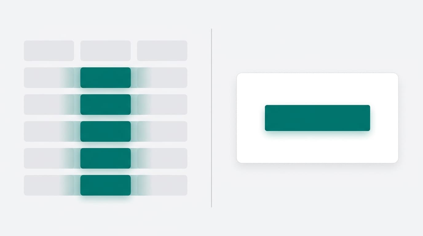
Block 6: Single CTA. Pages with one primary CTA convert around 13.5% on average. Pages with five or more links drop to about 10.5%. (involve.me) Pick one action and design everything toward it.
Building the Evidence Section: What Actually Counts as Proof
Evidence is not all the same. Four types hold up under scrutiny, and you want all four if you can get them.
Quantitative benchmarks. Speed tests, output word counts, pricing math, time-to-publish. Numbers that readers can verify or replicate. These are the strongest evidence type because they're falsifiable.
Third-party ratings. G2 or Capterra scores with dates attached. A rating from 2021 is weak if your competitor repriced or rebuilt their product in 2024. A comparison page that cites a stale pricing figure for a competitor that repriced since then destroys credibility the moment the reader checks. Fact-check every claim before it publishes.
User-generated proof. Screenshots of real outputs, not stock images. A screenshot of your tool's actual research pipeline or citation list does more work than any bullet point. A screen recording does even more. Adding a product demo or explainer video can increase conversions by as much as 86% in some cases. (involve.me) That's not a trivial lift. A short recording of the tool actually running beats a list every time.
Structured citations. Linked sources with publication dates. This is the format that answer engines extract from. Unsourced claims stay invisible to AI shortlists regardless of how well-written they are. (jam7.com)
The SERP gap worth knowing: most competing comparison articles talk about evidence conceptually. They say "provide proof" without defining what proof looks like. That vagueness is why so many comparison pages feel thin even when they're long.
Comparison Table Design: What Makes One Actually Readable
Table design is where the logic of a good comparison page either holds up or falls apart. A few specific decisions make the difference.
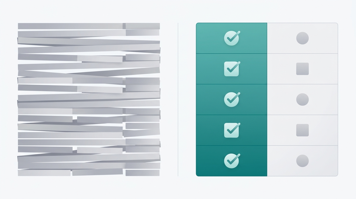
Keep the table to the features that decide the purchase. A page showing five relevant features converts better than one showing twenty. (prospeo.io) More rows don't signal more credibility. They signal that you didn't filter.
Use consistent labels. If one column says "Yes" and another says a checkmark for the same feature, readers notice. Inconsistency signals that the table was built to win arguments, not to inform decisions.
On formatting: highlight your column with positive markers. Green checkmarks on your rows, neutral gray on theirs. Avoid red X marks on competitor rows unless the gap is factual and sourced. A table that uses red X marks without citations looks biased. A table with neutral gray on competitor gaps looks confident. Good spacing, simple labels, and consistent formatting keep everything easy to read. (weareyellowball.com)
Mobile is not optional. Mobile accounts for 65% of all website traffic but converts at only 1.82% compared to desktop's 3.14%. (digitalapplied.com) Comparison tables are the hardest element to render on small screens. Horizontal scroll tables lose readers. Use a stacked card format for mobile or a simplified summary table with a link to the full comparison. Pages designed desktop-first and shrunk to mobile can lose 40-60% of mobile conversions. (bntouch.com)
Conversion Blocks: Where Founders Leave Deals on the Table
The hero, evidence section, and comparison table do the trust-building work. The conversion blocks close. Treat them as a separate design problem from the informational sections.
Place your primary CTA after the criteria table, not just at the bottom of the page. Readers who finish the table have usually made a mental decision. They just need a nudge. A CTA at that point catches them when intent is highest. Most pages only put the CTA at the bottom, which means readers who decide at the table still have to scroll through three more sections before they can act.
The "decision aid" block is the conversion placement most founders skip. Two columns: "Pick us if..." and "Pick them if...". Name the scenarios where you lose. This is counterintuitive. It also converts because it signals confidence and reduces buyer anxiety. Readers who are close to a decision are also the most suspicious of sales copy. Naming your limitations honestly is the fastest way to dissolve that suspicion.
An FAQ block serves double duty. It answers the objections that come up in "X vs Y" searches, like pricing differences, migration effort, and output accuracy. It also captures the follow-up queries buyers type into Google after reading a comparison. If you answer those questions on the page, you keep the reader in your funnel instead of sending them back to search.
Page speed belongs in the conversion section because it is a conversion problem. Pages that load in 1 second have 3x higher conversion rates than pages that take 5 seconds to load. (involve.me) A slow comparison page loses the reader before the table renders. This isn't a nice-to-have for high-intent traffic. A visitor who searched "X vs Y" will leave in 3 seconds just like anyone else.
Measuring Whether Your Comparison Page Is Working
Track three metrics separately, because they diagnose different problems.
Organic traffic. Are you ranking for the "X vs Y" query? If traffic is low, the problem is SEO: page authority, keyword targeting, or internal linking from related posts.
Scroll depth. Are readers reaching the CTA block? If traffic is healthy but conversions are low, scroll depth tells you where the page loses people. A 40% drop-off at the criteria table means the table is either too complex or not mobile-friendly.
Conversion rate. Are readers who reach the CTA actually clicking? The top 10% of pages convert above 11.45%. (waypointconverts.com) If you're below 3%, the gap is usually in the evidence section or the CTA placement, not the traffic source.
Also check for AI citation. Search your comparison query in ChatGPT, Perplexity, and Claude. If your page isn't appearing in the answer, the evidence blocks lack the structured, sourced format that answer engines extract from. (jam7.com) That's fixable by adding inline citations and structuring claims as discrete, attributable facts.
Set a 90-day review cadence. Competitor pricing changes. Features ship. A comparison page that was accurate at publish can silently become misleading. A misleading comparison page destroys exactly the trust you built to earn it.
FAQ
Does naming cases where I lose actually help conversions, or does it just give readers a reason to pick the competitor?
It helps. Readers who are close to a decision are the most skeptical of promotional framing. Acknowledging a real tradeoff, like "Jasper is faster if volume matters more than citations," signals that the rest of your comparison is honest too. It also keeps the reader on your page instead of searching for a more balanced take elsewhere.
How many features should go in a comparison table?
Five to seven features that directly influence the purchase decision. A page that shows five relevant features converts better than one showing twenty. (prospeo.io) The goal is to show the features that matter to your specific buyer, not to document every capability you have.
My competitor repriced recently. How do I keep the page accurate without republishing constantly?
Add a "last verified" date to your pricing rows and set a calendar reminder to check them quarterly. Stale pricing figures are one of the fastest ways to lose credibility with high-intent readers who will often check your claims against the competitor's current pricing page.
Should I build one comparison page per competitor or a single multi-competitor page?
One per competitor, with a dedicated URL for each. A page built around a specific "X vs Y" query ranks for that query. A multi-competitor page dilutes the signal for all of them. It also makes the evidence section harder to keep accurate and the use-case routing block harder to write with specificity.
What's the right CTA for a comparison page: free trial, demo request, or something else?
Match the CTA to your sales motion. If your product has a self-serve trial, a "Start free trial" CTA works because it removes friction at the moment of decision. If your product requires a sales conversation, a demo request with a specific value hook converts better than a generic "Contact us." The key is one CTA, not multiple options. Pages with a single primary CTA convert around 13.5% on average versus about 10.5% for pages with five or more links. (involve.me)
Sources
- involve.me - Landing Page Statistics
- jam7.com - Comparison Content Strategy for AI Shortlist Visibility
- digitalapplied.com - Conversion Rate Benchmarks 2026 by Industry and Channel
- waypointconverts.com - Landing Page Conversion Rate Benchmarks by Industry
- prospeo.io - ABM Landing Pages
- weareyellowball.com - How to Design Comparison Tables That Convert
- bntouch.com - Mortgage Landing Page Templates and Conversion
Pick a competitor your buyers are already comparing you against. Build one page using the six blocks above. Cite every differentiating claim. Put the "Pick us if / Pick them if" block before the final CTA. Then search that "X vs Y" query in Perplexity and see if your page shows up in the answer. That's the test. If you want a draft that ships with citations already sourced and fact-checked, Ryterr runs the full research pipeline for you in about five minutes.