
Content Dashboard: Which Blog Metrics Predict Pipeline
Your blog traffic went up last month. Congratulations. Now answer this: how much pipeline did it create?
Most founders can't. They have Google Analytics open, they can see sessions climbing, and they still can't connect that number to a single dollar of qualified revenue. The dashboard shows activity. It doesn't show intent. And there's a difference.
This post isn't a tour of dashboard features. It's a working framework. You'll leave with a specific set of metrics that predict pipeline, a clear way to separate leading indicators from lagging ones, and thresholds you can actually act on. Five metrics. One page. Decisions that fire on their own.
Why Traffic Is a Lagging Lie
Pageviews feel like progress. Sessions trending up in GA4 feels like proof the content is working. But here's the problem: by the time traffic tells you something meaningful about pipeline, it's already too late to change what caused it.
Traffic is a lagging indicator dressed up as a leading one. You published the post six weeks ago. The keyword started ranking three weeks ago. The traffic showed up last week. And if that traffic isn't converting, you're already a month behind on the fix.
Most content dashboards make this worse, not better. They show you the number that's easiest to pull, not the number that changes what you do next week. Broad guides on dashboard categories from sites like (Highspot) and (Domo) cover metric types clearly but rarely isolate which content metrics actually predict revenue. The category exists. The specific answer doesn't.
The test for any metric is simple: if this number crosses a threshold, do I do something different next Tuesday? If the answer is no, that metric doesn't belong on your dashboard. It belongs in a report you read once a quarter and forget.
The Two-Layer Model: Leading vs. Lagging
Every metric you track sits in one of two layers. Get this distinction wrong and your whole dashboard is built backwards.
Leading indicators tell you what's likely to happen to pipeline in the next 30 to 60 days. For content, these are:
- Scroll depth past 60% on a given post
- Return visits to that post within 14 days
- CTA click rate on demo or trial links embedded in the post
- Time-on-page above 2 minutes
These numbers move before pipeline does. They're signals of intent, not proof of it. A reader who scrolls 80% of a 2,000-word post and clicks your demo CTA is behaving like a buyer. They may not convert today. But they're telling you something.
Lagging indicators confirm what already happened:
- Pipeline value created from content-sourced contacts
- Closed-won revenue attributed to a specific blog post
- Customer acquisition cost broken out by content channel
The (forecastio.ai) framing of sales KPIs applies directly here: leading metrics like meetings booked and pipeline created are the ones worth watching closely because they give you time to act. The same logic translates to content dashboards. Watch your leading indicators weekly. Your lagging indicators monthly.
Most founders only track lagging indicators because those are the numbers that appear in CRM reports and quarterly reviews. The cost is that you're always reacting. A post underperformed, but you find out two months after it published. By then, you've already published six more posts using the same broken approach.
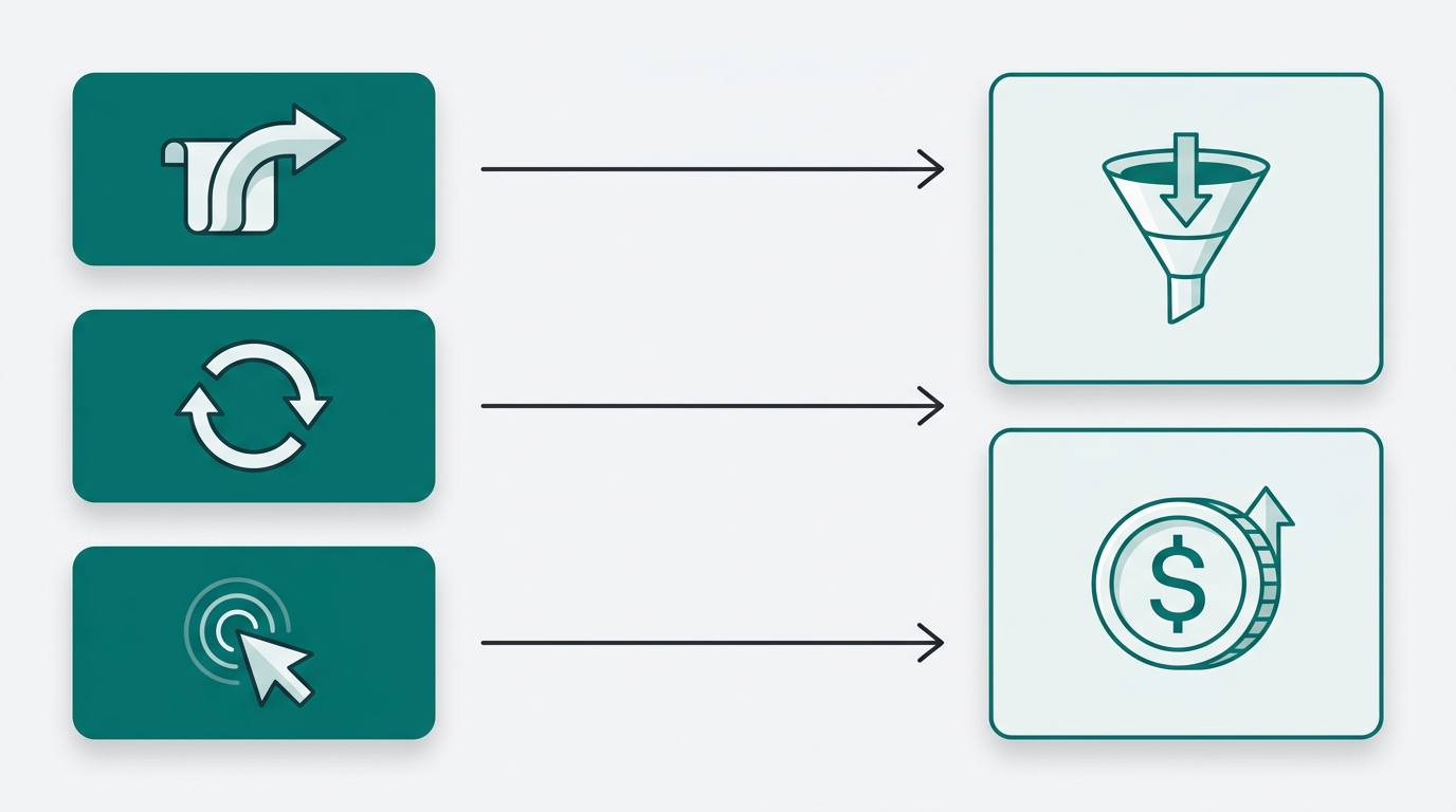
The Five Metrics Worth Putting on Your Dashboard
Here's the short list. Everything else is optional.
1. Organic-to-demo conversion rate by post. Sessions from a specific post divided by demo or trial signups attributed to that post. Set your internal floor at 0.5%. Posts below that threshold need either a CTA rewrite or a keyword intent audit, not more traffic.
2. Return visitor rate per post. Readers who come back to the same post within 14 days are signaling genuine consideration, not accidental clicks. Benchmark this against your site average. A post running well above average is already doing sales work for you.
3. Scroll depth distribution. If fewer than 40% of readers on a post reach the 60% scroll mark, that can be a useful internal signal that the post isn't doing its job regardless of how much traffic it gets. High traffic plus shallow scroll depth means you're ranking for the wrong keyword or burying your argument too deep.
4. Content-sourced pipeline value. The dollar value of open deals where the first or last touch was a blog post. This requires UTM discipline and CRM tagging to get right, but it's the only metric that closes the loop between content investment and revenue.
5. Keyword-to-pipeline match rate. Of the keywords driving traffic to a post, what share map to problems your paying customers actually named in sales calls? Traffic from keywords your buyers never search is vanity traffic, and no conversion rate optimization fixes that.
The (concretecms.com) framework for KPI dashboards gives useful structural guidance here: keep the metric set small, define the decision each metric drives, assign an owner, and set a review cadence before you ever look at the numbers. Most founders skip those steps and end up with a dashboard full of numbers no one acts on.
How to Tag and Track Without a Data Team
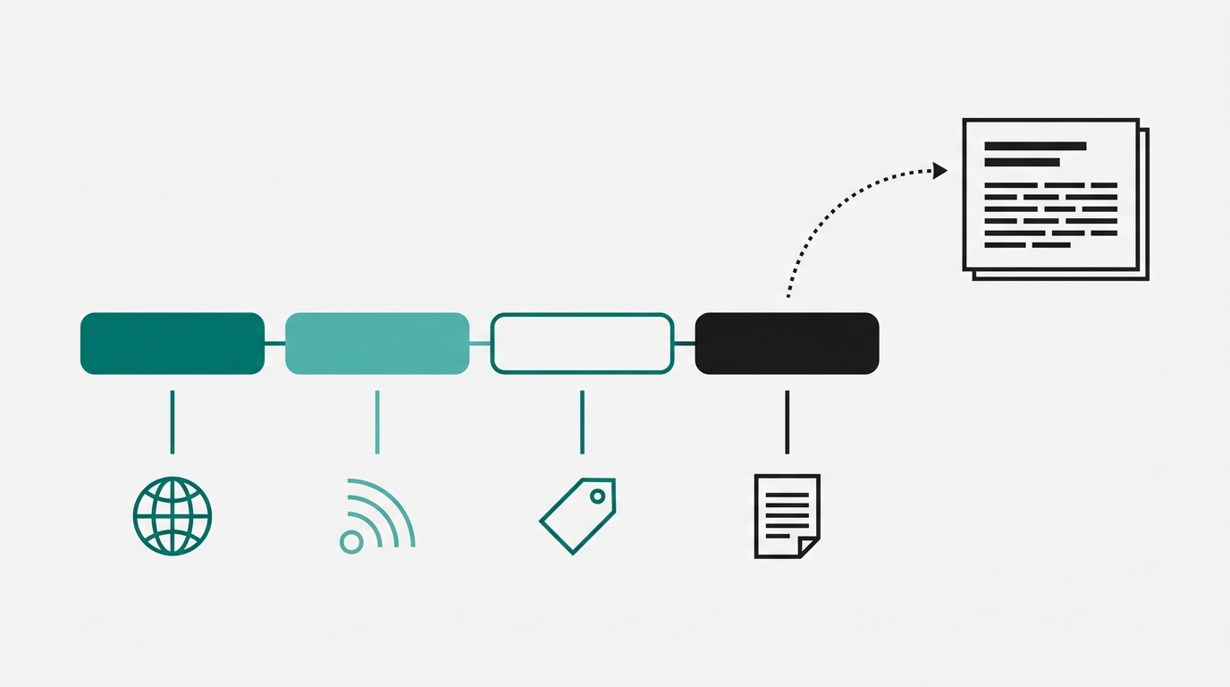
The reason most content dashboards fail isn't metric selection. It's data plumbing. (Improvado) makes this point plainly: dashboards break at the data layer, not the visualization layer. Fix the plumbing first.
Here's the minimum viable setup for a solo founder or small team.
UTM structure for blog CTAs: Every internal link pointing from a blog post to a demo, trial, or contact page should carry UTM parameters. Use utm_source=blog, utm_medium=organic, and utm_content=[post-slug]. That last parameter is the one most people skip. Without content, you know traffic came from the blog. With it, you know which post sent it.
CRM tagging: Create a "content-sourced" contact property in HubSpot or Attio. Use hidden form fields to capture the UTM parameters on submission. When a reader fills out your demo form after reading a post, that contact record shows exactly which post touched them. No manual logging required.
GA4 custom exploration: Build one exploration report filtered by landing page. Add sessions, average engagement time, and scroll depth as metrics. Add your demo completion as a conversion event. That single report gives you leading and lagging indicators in one view, no BI tool required.
GA4 plus one CRM with UTM capture handles roughly 80% of what you need to run this framework. You don't need a data warehouse, a Looker dashboard, or a growth hire. You need consistent UTM discipline on every CTA you publish.
Setting Thresholds That Trigger Decisions
A threshold isn't a goal. A goal is something you aspire to. A threshold is a number that, when crossed, fires a specific action automatically. No meeting needed. No conversation about whether to act. The threshold does the deciding.
Three examples you can use today:
Organic-to-demo rate drops below 0.3% for two consecutive weeks: Rewrite the CTA section of that post. Then check keyword intent alignment. A reader landing on that post may be researching, not buying, and no CTA rewrite fixes a keyword mismatch.
Return visitor rate on a post exceeds 20%: That post is a candidate for a content upgrade or a lead magnet. Readers are coming back because the content is valuable but something isn't closing them. Give them a reason to convert, not just a reason to return.
Content-sourced pipeline drops below 15% of total pipeline: Your publish cadence or topic selection is broken. Audit the last eight posts. Look at keyword-to-pipeline match rate for each one. Chances are you've drifted into topics your buyers don't search.
The (concretecms.com) step-by-step approach reinforces this: define the decision each metric drives before you add it to the dashboard. If you can't name the action a threshold fires, the metric doesn't belong there yet.
What a Working Dashboard Actually Looks Like
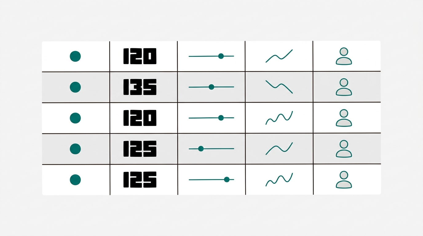
One page. Five rows. That's it.
Each row covers one metric. Each row has five columns: the metric name, its current value, the threshold, a 30-day trend sparkline, and the action triggered if the threshold fires. The action column is the one most dashboards skip. It's also the only reason the dashboard exists.
Review cadence splits by layer. Leading indicators (scroll depth, CTA click rate, return visitor rate) get a weekly review. Ten minutes. One person. Lagging indicators (pipeline value, closed-won attribution) get a monthly review tied to whatever revenue cadence you already run.
Ownership matters more than most founders expect. Each metric should have one person responsible for the action when a threshold fires, not just for reporting the number. Reporting without ownership produces dashboards that get reviewed, discussed, and then ignored.
(Improvado's) dashboard design guidance makes the failure mode clear: dashboards fail when they show data without connecting it to a decision. A number without a threshold is decoration. A threshold without an owner is a suggestion. Get both right and the dashboard runs itself.
A related point from (agencydashboard.io): SEO blog performance is most useful when the metrics feed back into content decisions, not just reporting cycles. That feedback loop is exactly what thresholds create.
FAQ
How do I attribute a demo signup to a specific blog post when the reader visits multiple times before converting?
Use both first-touch and last-touch attribution and track both in your CRM. First-touch tells you which post introduced the buyer to your brand. Last-touch tells you which post closed the loop. For pipeline prediction, first-touch is more useful because it shows you which content is creating net-new demand.
What if my demo volume is too low to make conversion rate data statistically meaningful?
Below roughly 20 to 30 conversions per post per month, conversion rate can swing a lot from week to week as an internal rule of thumb. In that case, weight your leading indicators more heavily. Return visitor rate and scroll depth are useful signals even at low volume. Use conversion rate as a directional number, not a precise one.
My blog posts don't have direct demo CTAs. Does this framework still apply?
Yes, but you need to add a next step that you can track. That might be a content upgrade download, a newsletter signup, or an email link to book a call. The metric stays the same: sessions divided by tracked conversions from that post. The conversion event just changes.
How long should I wait before pulling conversion data on a new post?
Give a post at least 30 days of organic traffic before judging its conversion rate. Most posts take 3 to 6 months to build meaningful search volume. Pull leading indicators (scroll depth, CTA clicks) in the first two weeks to check whether the content is engaging. Pull conversion rate at the 30-day mark and again at 90 days.
What's the minimum UTM setup I need before this whole framework breaks down?
You need utm_content capturing the post slug on every demo or trial CTA link inside your blog posts. Without that, you can see that your blog drove conversions but not which posts drove them. That's the single parameter that makes the organic-to-demo conversion rate calculable at the post level.
Sources
- Highspot: Sales Dashboards
- forecastio.ai: Sales KPIs
- Improvado: Dashboard Design Guide
- Domo: Marketing Reporting
- concretecms.com: KPI Dashboard Guide
- agencydashboard.io: Blog for SEO
Pick one post from the last 30 days that drove the most traffic. Pull its organic-to-demo conversion rate. If you can't get that number in 10 minutes, your tracking setup is the first thing to fix. Add UTM tagging to that post's CTAs today, connect it to your CRM, and check back in two weeks. That single number will tell you more about your content's pipeline contribution than any traffic report you've read this month. If you want the research, drafting, and citation work handled so you can focus on the numbers, Ryterr runs the full pipeline and ships you a post with the receipts already attached.